The original was meant to be minimalist. However, it turned out to be boring. It’s a lesson I learned long ago, sometimes what works in a small piece looks like hell when you enlarge it. So,I added a few patterns and designs that I could sink my teeth into! I think it turned out more interesting, although far from my original idea. So moving on…
I promised a look again at the boring titles of the category of not a chance. These are among the drawings for the show that I have entered to the jury. Not sure when I hear back.
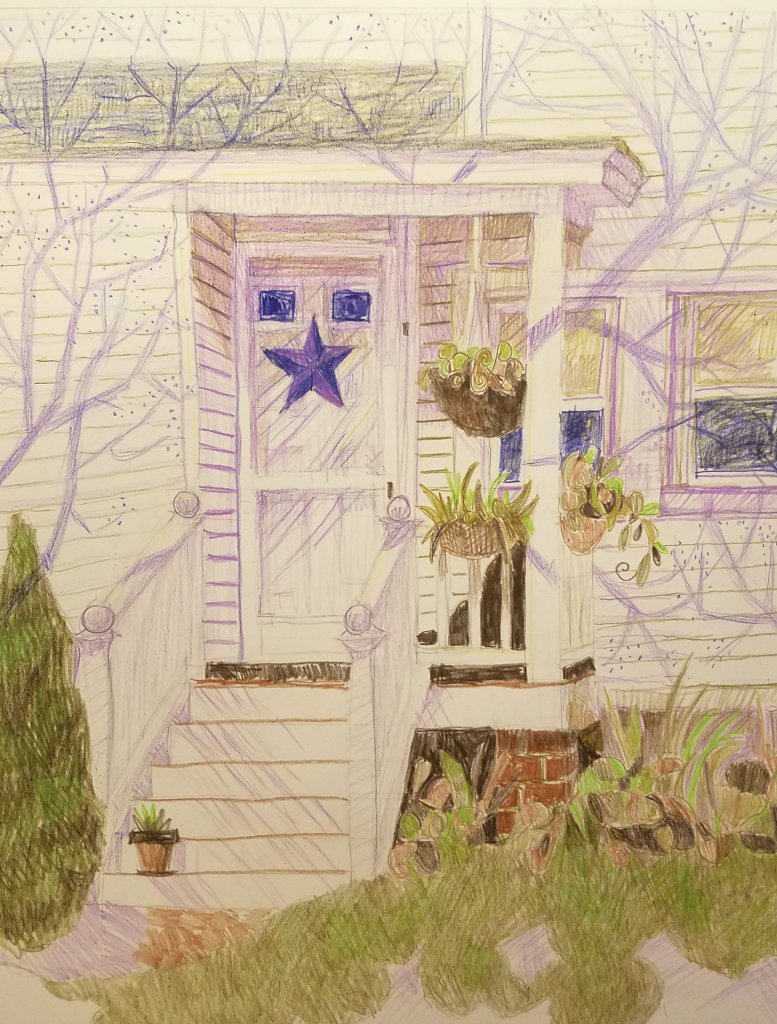
This is “Number 35”,which I feel is a lackluster summertime drawing. With a lackluster title. I think I should rename it “Hidden Stairway “,which is the real subject of the drawing. Some of these drawings I really like, but they don’t fit into the style or subject matter of my usual work. Such is the case with “Rocking Chair “. I think I will rename it “Rock, Rock, Rock!”. For no particular reason, except..it’s more interesting. This is “Constellation “. Not a bad title, but a drawing that falls short of my usual quality. And so it goes.
“Cloudy Day ” Can you imagine anything more boring than that? Yes,the drawing itself. It was one of those drawings trying to find beauty in a sunless day. Failed miserably. But “Sunless ” is a better title.
This is “The Greening “. I like the name and the drawing. However, again it doesn’t fit with my usual style. All the advice I have gotten from career instruction is that I should be branding myself. I should ignore advice, I really, really should.
Anyway, the ayes have it. Let’s look into better titles for the ones I have chosen…next time


Leave a comment