Yes, computers are awesome…but I’ll get back to that in a minute.
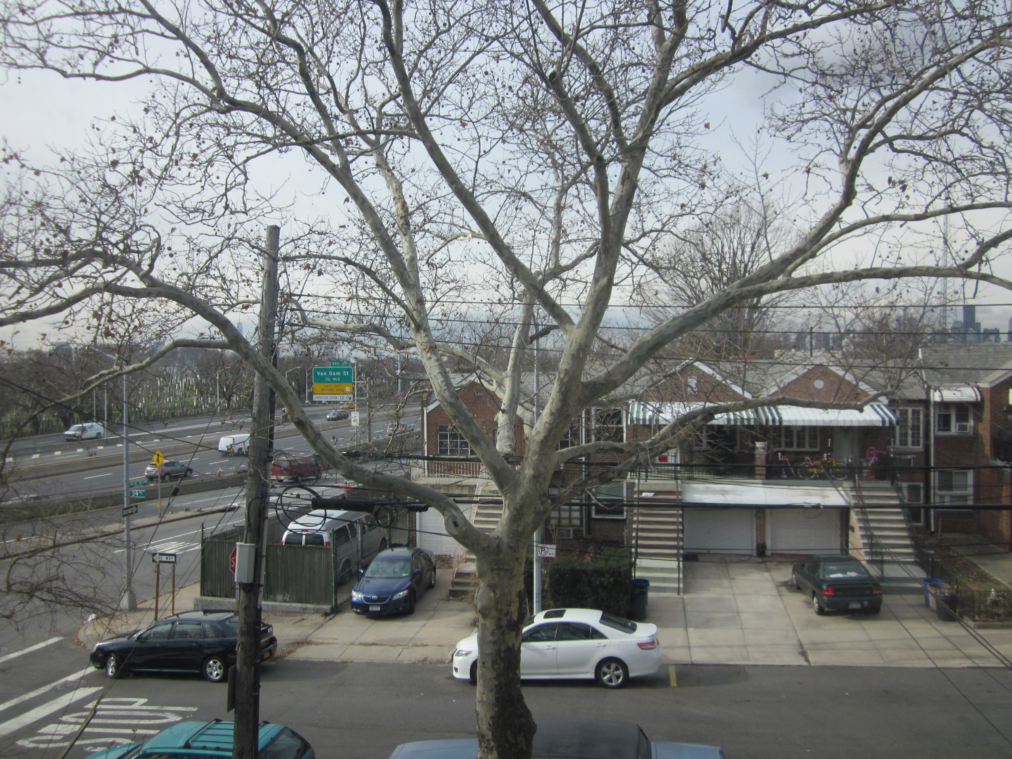
It occurs to me that I have done many drawings (including the one I’m working on now) of the sycamore tree out front. I have however, never posted a photo of it, so you can see it’s beauty for real…so, here’s the view of the tree from my window, Queens row houses and all.
So, now computers………..
I love the fact that I can go into a desktop publishing program, or even these days, a good word processing program, and come up with something professional looking by scrolling and clicks of the mouse. Such a difference.
When I was your age (Yes, this is one of those) cut and paste was done by hand. My parents enrolled me in a course in it, figuring that if I was going to be an artist, this would provide me with an income. I was really sure that by the time I was 25 I was going to be rich and famous….but I went along with it anyway.
It was a matter of taking little printed papers with letters on them, and lining them up perfectly so they could be photographed for print. Of course, if you drew a line in regular pencil, that would show up to the camera. If you erased that would look even worse. But there was a solution…..
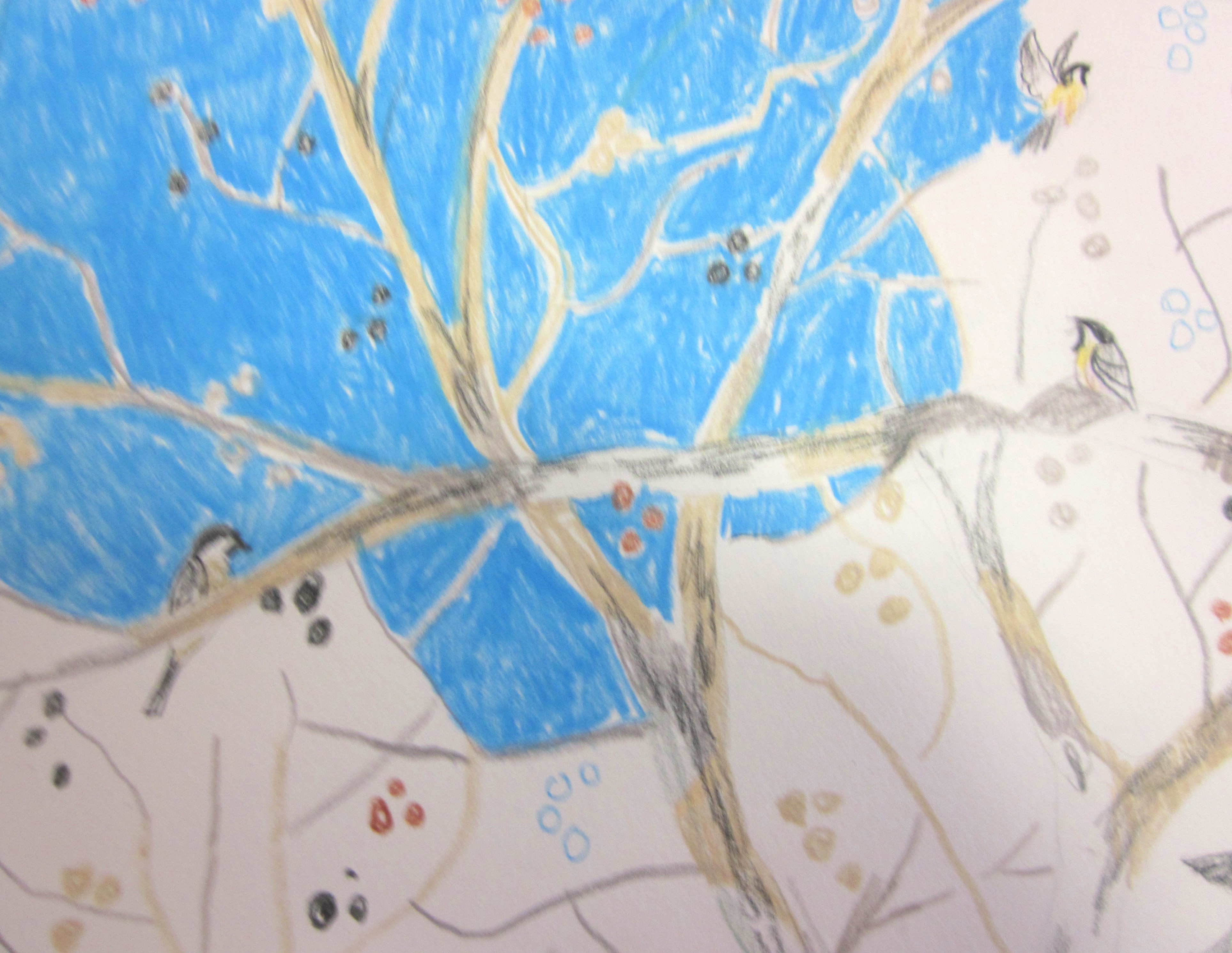
Non-photo blue.
This was a color that was invisible to the black and white camera. So, graphic artists used it to painstakingly line up letters. Did I mention the pain in painstaking? BTW, I completely failed at cut and paste.
I’m sure there are very few, if any, graphic artists who do cut and paste manually. However, Prismacolor still makes the color. I think because it’s a beautiful, clear, intense color. It’s perfect for skies, imho.
So, here’s a detail from “Making Peace with December”to give you a taste of what I’m working on. Also, a good example of Non-photo blue.

Leave a comment